Netflix:
UX Case Study
2021 | Timeline: 15 weeks | UX Research & Design
Overview
With more and more people turning to streaming services, our team wanted to analyse what could be improved on the Netflix desktop website, to ensure that it continues to meet the expectations of its users and to make their experience better.
Our aim was to use the lens of the user and design solutions based on our learnings about their behaviours, experiences, pain points and preferences.
Key Insights and Pain Points
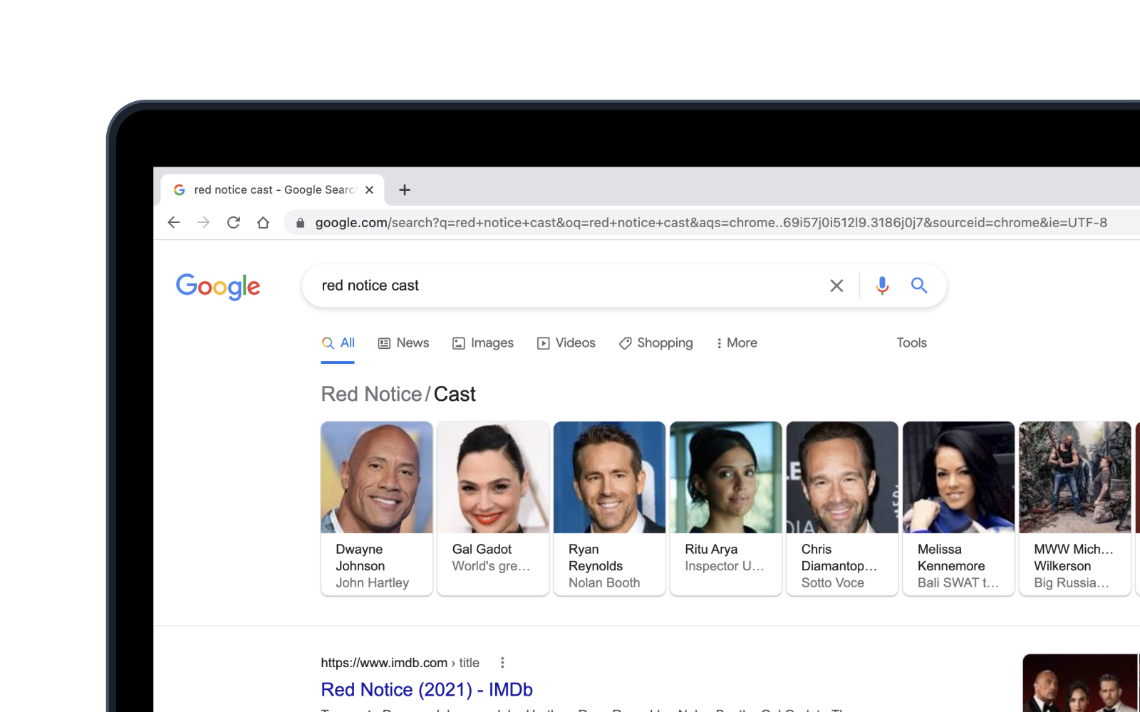
Problem 01: Leaving Netflix to check ratings & reviews
Users like to view ratings and/or reviews before committing to a particular movie or show. They had to leave the Netflix platform to do so or had to use another device which was inconvenient and distracted the viewer.
Problem 02: Leaving Netflix to check Cast Information
Viewers often want to check additional cast information and had to leave the Netflix platform or use another device to do so.
Problem 03: Unclear feature and inability to hide disliked content
Users did not understand the functionality of the thumbs down feature because they could still see the disliked content on their wall which was frustrating. (Not intuitive; leaves the user guessing about the action).
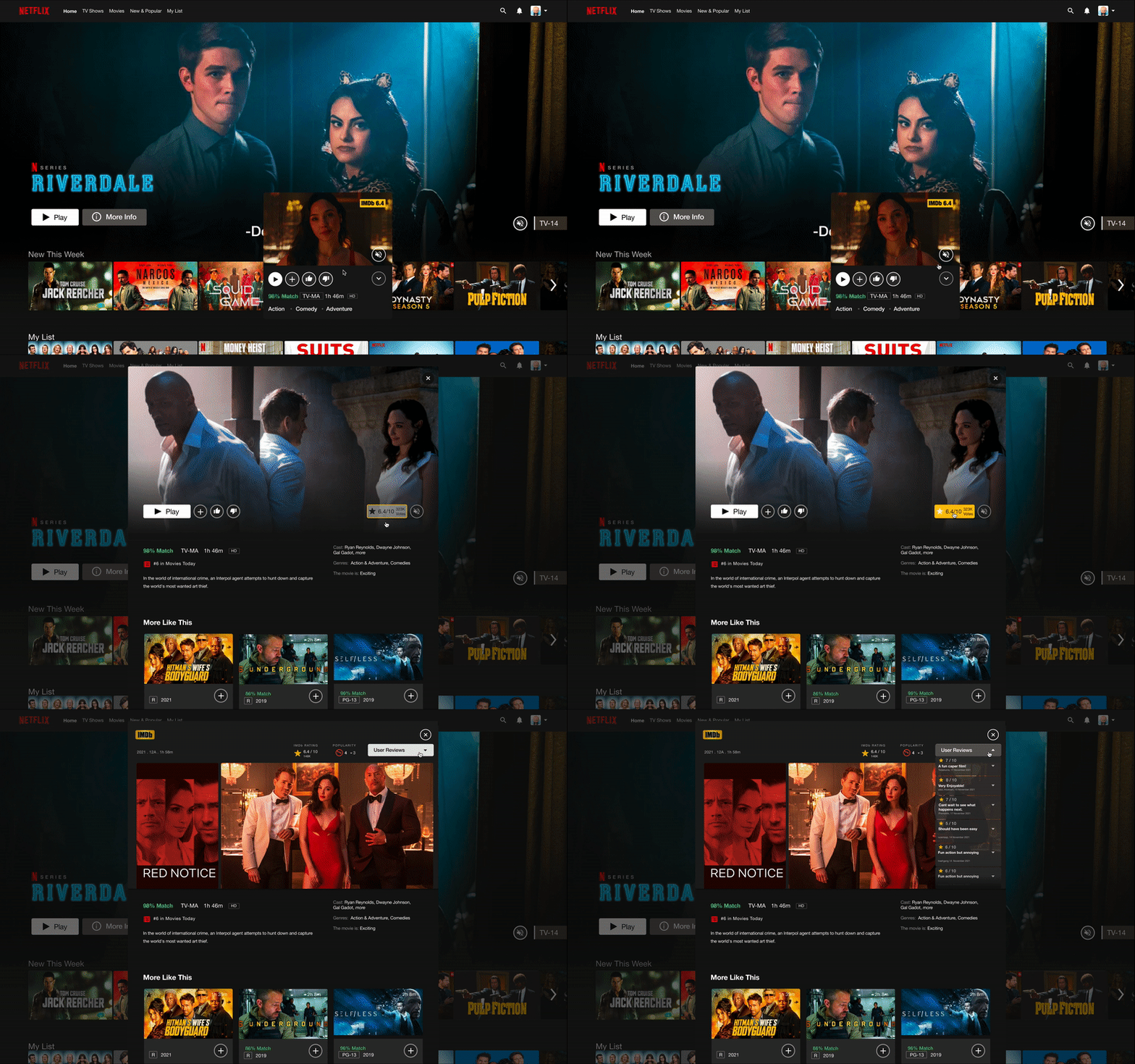
Proposed solution 01: Check ratings & reviews within Netflix
Introduced a button with the functionality to open an IMDB pop-up window within Netflix. This allows users to check ratings & reviews from a credible source without leaving the platform.
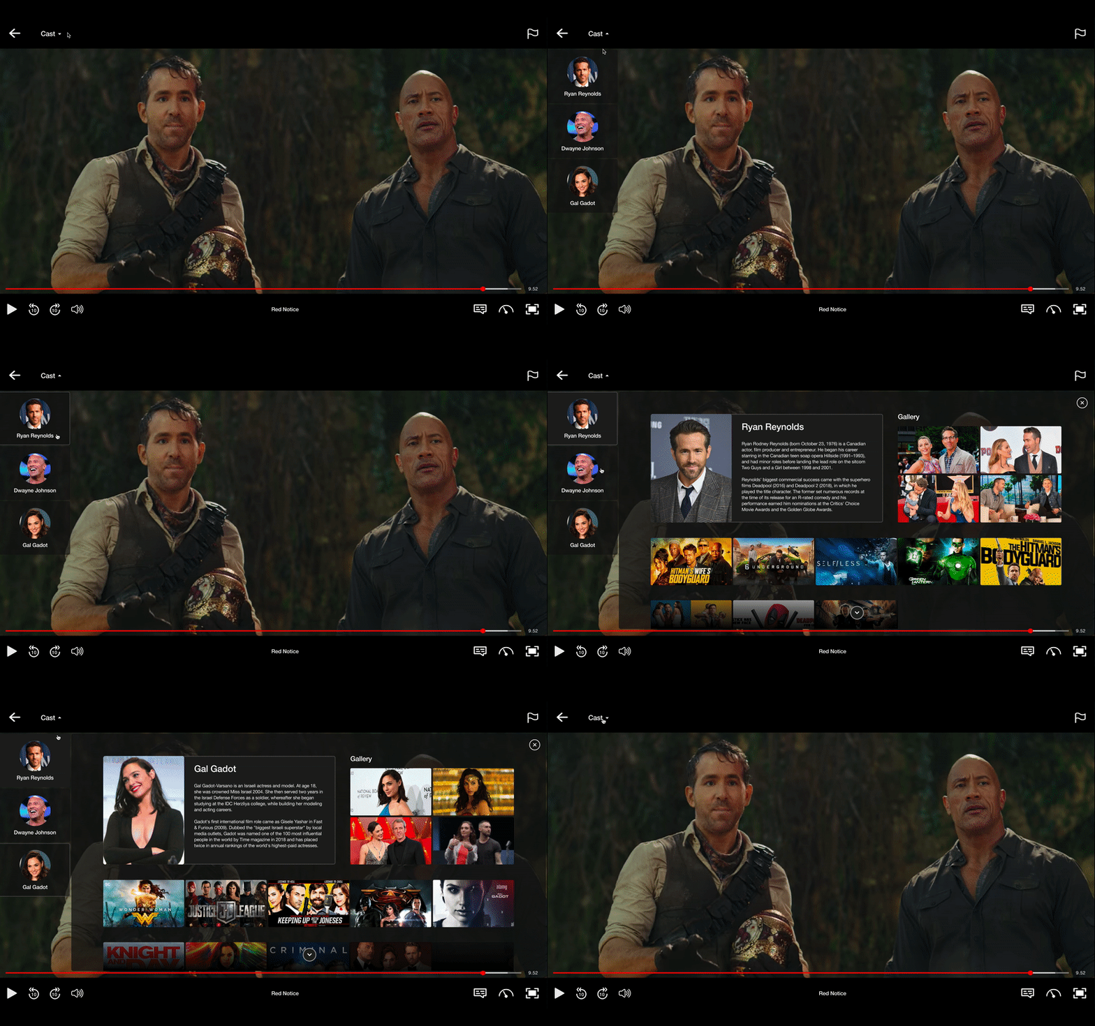
Proposed solution 02: Check cast information within Netflix
Option to view cast info with ‘Cast’ option in player or by clicking on the cast member’s name in the description window)
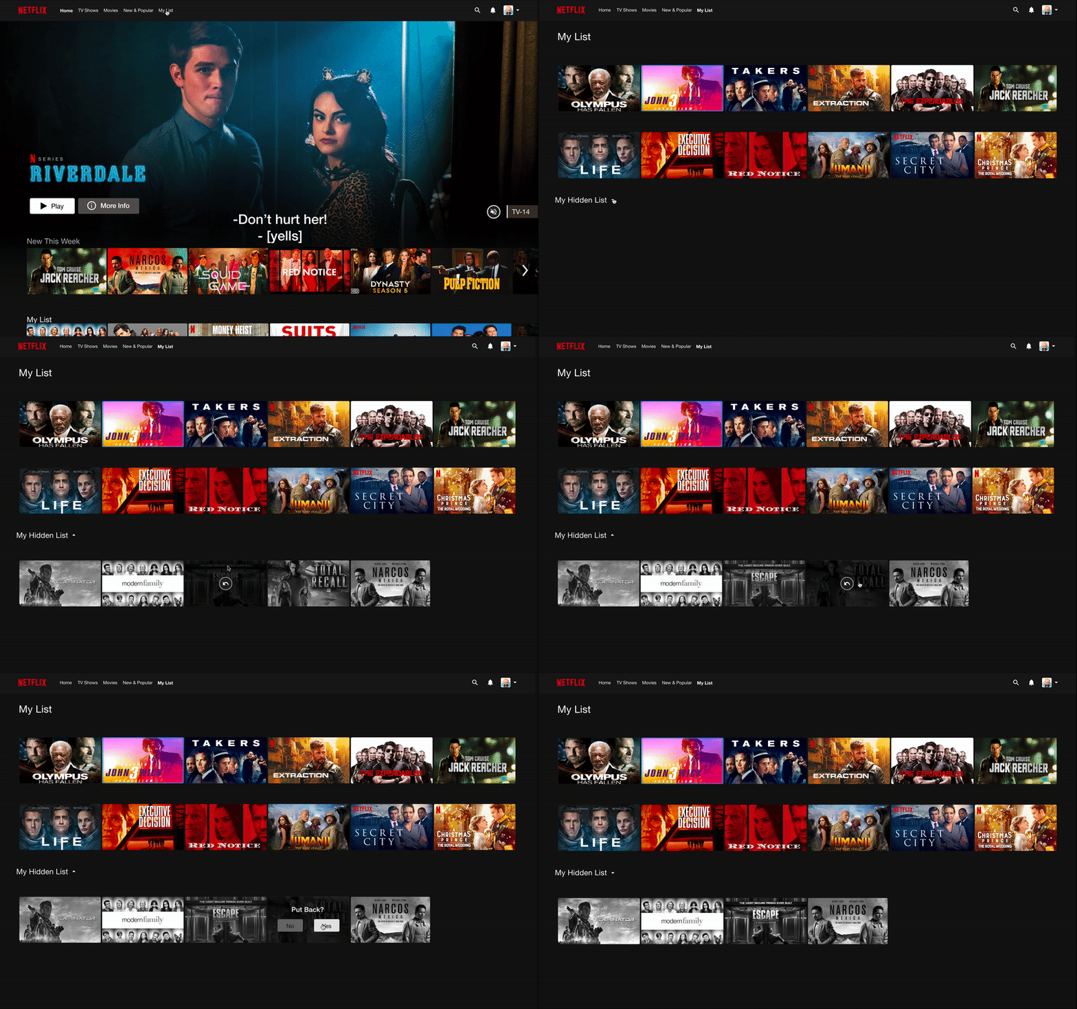
Proposed solution 03: Allow users to hide & retrieve content
Added a functionality that allows users to add their disliked content to a ‘hidden list’ (Grey thumbnails show a visual distinction from other thumbnails). Content added to this hidden list is retrievable.
Approach: The Design Thinking framework was the backbone of the research and design process for this project
Process and Timeline
Competitor Study and Analysis
Netflix was player 1 in the market, but the competition is catching up; and they’re doing it well.
Purpose: To identify and examine Netflix’s competition and analyse what they are doing differently and doing well. Also assess what can be improved for Netflix.
Competitors examined: Disney Plus and Amazon Prime Video
Parameters for analysis: Business Goals, User Goals, Usability, Heuristic Evaluations, SWOT analysis, Visual Design
Some shortcomings we chose to address:
Ratings and Reviews: Netflix does not display ratings and reviews for its content, leading its viewers out of the platform to check it (Prime Video has ratings within the platform)
Facts and Trivia: Netflix is missing the option to view facts and trivia (Prime Video does it well)
Thumbs Down feature: The function of the thumbs down feature is confusing and needs improvement
User Interviews
Conducted 8 remote user interviews of full-time students in Toronto, who are studying remotely
Aim: To dive deeper and get an understanding of users’ pain points while using the Netflix platform. We focused majorly on trying to get insights about the chosen findings from our competitor analysis.
Key Insights
Users checking ratings and reviews:
5/8 on IMDB; 4/8 with Google Search; 5/8 on IMDB;
Users looking for cast information (4/8):
6/8 users want to view it after or before watching
4/8 users want to view it while watching
7/8 users wanted an option to remove disliked content
To analyse our interview findings, we did an affinity mapping exercise
Based on our affinity mapping, we created our user persona: Rachel Green
User Persona
Feature 1: Ratings & Reviews
1.1 User Journey Map
1.2 Task Flow
1.3 Usability Testing and updates for Feature 01
We conducted 8 moderated remote usability tests on our low fidelity prototype and updated our designs based on the insights we got from there
1.4 Product Feature Demo: Ratings & Reviews
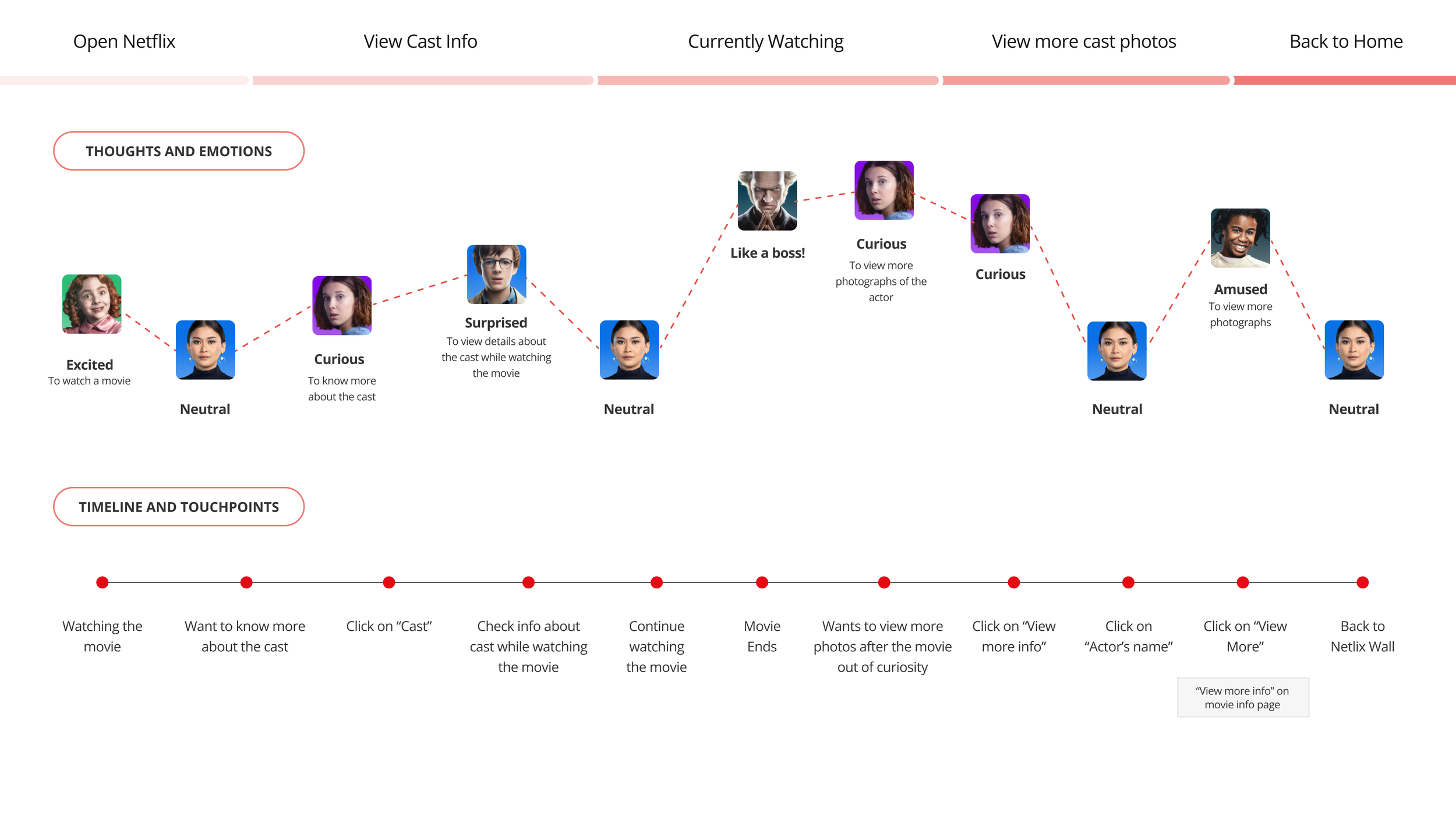
Feature 2: View Cast Information
2.1 User Journey Map
2.2 Task Flow
2.3 Wireframe to High-Fidelity mockup
2.4 Product Feature Demo: View Cast Information
Feature 3: Hide & Retrieve content
3.1 User Journey Map
3.2 Task Flow
3.3 Usability Testing and updates for Feature 03
3.4 Product Feature Demo: Hide and Retrieve Content
DISCLAIMER: It should be noted that this case study is the outcome of a college project, and was undertaken as an academic exercise completed at Humber College. The information used does not represent the views of Netflix or any other individuals referenced or acknowledged within it. No monetary profit was generated through this.


